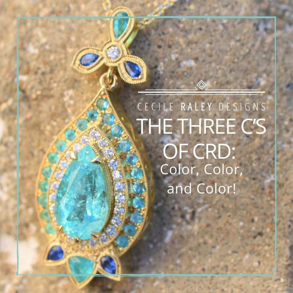
The Three C’s of CRD: Color, Color, and Color

What is the one thing, the main thing, that draws people to my shop? I think it’s color. Any aspect of it really. I get questions about gem color combinations, about how to work with different gold colors, questions about the color of gems from specific locations as well as gemstone pricing and value based on color. My best-selling gems and jewels sell because of their colors.
When I look for gems to curate in the shop, I care about cut, treatment origin, rarity, but most of all, I care about color. Color is my big C, the three other c’s (clarity, cut, carat) are secondary. Cecile, my middle name, is C for Color (ok, I just made that up)!
It only makes sense, therefore, to talk more about color. I’ve written many such blogs before, so for those of you who read everything I write, this is in part review. This blog focuses on metal colors, the next two blogs will discuss the importance of color in selecting gemstones, and how to combine gem colors in jewelry design.
How Metal colors affect design:
Yellow Gold
Yellow gold has a very traditional but also timeless look, and it is a color enhancer for most gemstone combinations. When designing with it, you should treat it as an additional color, so you need to work it in and think of it as adding yellow tones or warmth to your layout. Yellow gold can be combined with warm and cooler gemstone combos. In higher carats it’s great for working with soft stones. This is one reason why so much emerald jewelry is made in yellow gold.
Rose Gold
Rose gold blends well with most designs and skin tones; it enhances pinks, it contrasts with blues and greens, and all in all provides a softer contrast to color designs than yellow gold. It’s a go to for me because it runs no interference with my color layouts, but I have heard from clients that it doesn’t work well on yellowish skin. So you should try it first before you splurge. For setting purposes, it’s as hard as white gold.


White Gold
While slightly contrastive, white gold can wash out softer colors, so it’s best used with very vibrant tones that hold their own. I personally love white gold with neon red, for instance, but also with strong greens like Colombian emerald from Muzo. White gold is a “go to” metal for white diamonds because the diamonds blend with the white metal and make them look bigger. But for this reason, you have to consider that colored stone halos can have a sort of “metal” look when you use halo gems that are too small (you don’t face this problem with white diamonds). I find that with white gold the “metal look” can be stronger than with yellow or rose gold (the same is true for platinum). On the practical side, white gold needs to be rhodium plated on occasion, as rhodium rubs off over time, especially in rings.

Other gold colors: there’s green gold, peach gold, and a kind of grey gold on the market. I rarely use any, but here are some pointers.
Platinum
Platinum mostly works like white gold but it is actually a little bit colder in tone. To some people it looks greyish actually. However, in the current market it has the same price as 18kt gold so you might consider it as it ups the value of your piece at little extra cost – don’t forget that platinum is heavier than white gold (so if you have a metal weight in gold you need to convert it before you calculate the cost). Secondly, it is very easy for a setter to work with, especially when you are dealing with soft stones like Paraiba tourmaline. Nevertheless it lasts very well.
Other Metals
There are actually several other colors of gold available on the market today.
Green gold is really a cooler tone of yellow gold (sometimes described as olive). It is often cast in 18 kt because it looks too faint in 14. Green gold tones are in style so you may well have 18k gold jewelry that is officially yellow but has a cooler tone (so it’s closer to green gold than to yellow). If you like the more yellow look, then you might consider using 18 kt Royal gold (my casting service offers this, but only in 18, not in 14).
Peach gold is half way between rose gold and yellow gold. It’s not a loud color, softer than either rose or yellow in fact. You can use it to bring out yellow and peach or orange tones, or use it contrastively. I made a peach gold ring with a lavender halo and a pad-like orange sapphire that looked great and sold quickly.

Cocoa gold, as my casting service calls it, can be used in lieu of black rhodium and it won’t come off. It’s not as dark as black rhodium but rather has a hint of brown or grey depending on the light. I have not experimented with it to be honest, as it doesn’t work with my style. I think it would look great with white diamond or spinel, or with cooler blues. My mind’s eye envisions it set with hauyne and diamond.
A quick note on silver
Silver is a cheap metal, and great to work with for setting, but: (a) if you don’t like the oxidized look, that’s a problem because unless you submerge it in silver cleaner, it will not completely come off, and of course it will reappear. And (b), it IS soft. Silver prongs will break off easily, and a dainty ring can bend. If you have a nice stone to set, just save up for gold! Also, while we can in principle cast in yellow and pink silver, we strongly recommend against it as it oxidizes strongly and then looks quite ugly.

There’s such a thing as platinum silver too, which is 92.5% silver and 3-6% platinum. It will oxidize, albeit more slowly, and it is a little heavier. It will generally last better than silver, but not as well as gold.
At CRD, our go to metals are 18 and 14 kt yellow gold, 14 kt white and rose gold, and platinum. On special request, we can design in any other metal listed here, as well as 18K Palladium.

For more information, have a look at the website of our casting service here:


