How to Judge a Ceylon
It’s been an interesting year for Ceylon sapphires. Last summer, they were fairly reasonable in price, and I bought one for myself for a ring. Ever since then, customers have wanted a gem like mine: larger size (about 2 carats), nice rich popping blue, clean and sparkly, and unheated of course. But I couldn’t find any. The guy from Sri Lanka, from whom I bought my stone, was supposed to come back in spring, but spring came and went, but there was no sign of him. D. has only 1 carat pieces. Other guys have heated material only, and they wanted something like eight times what I originally paid for mine.
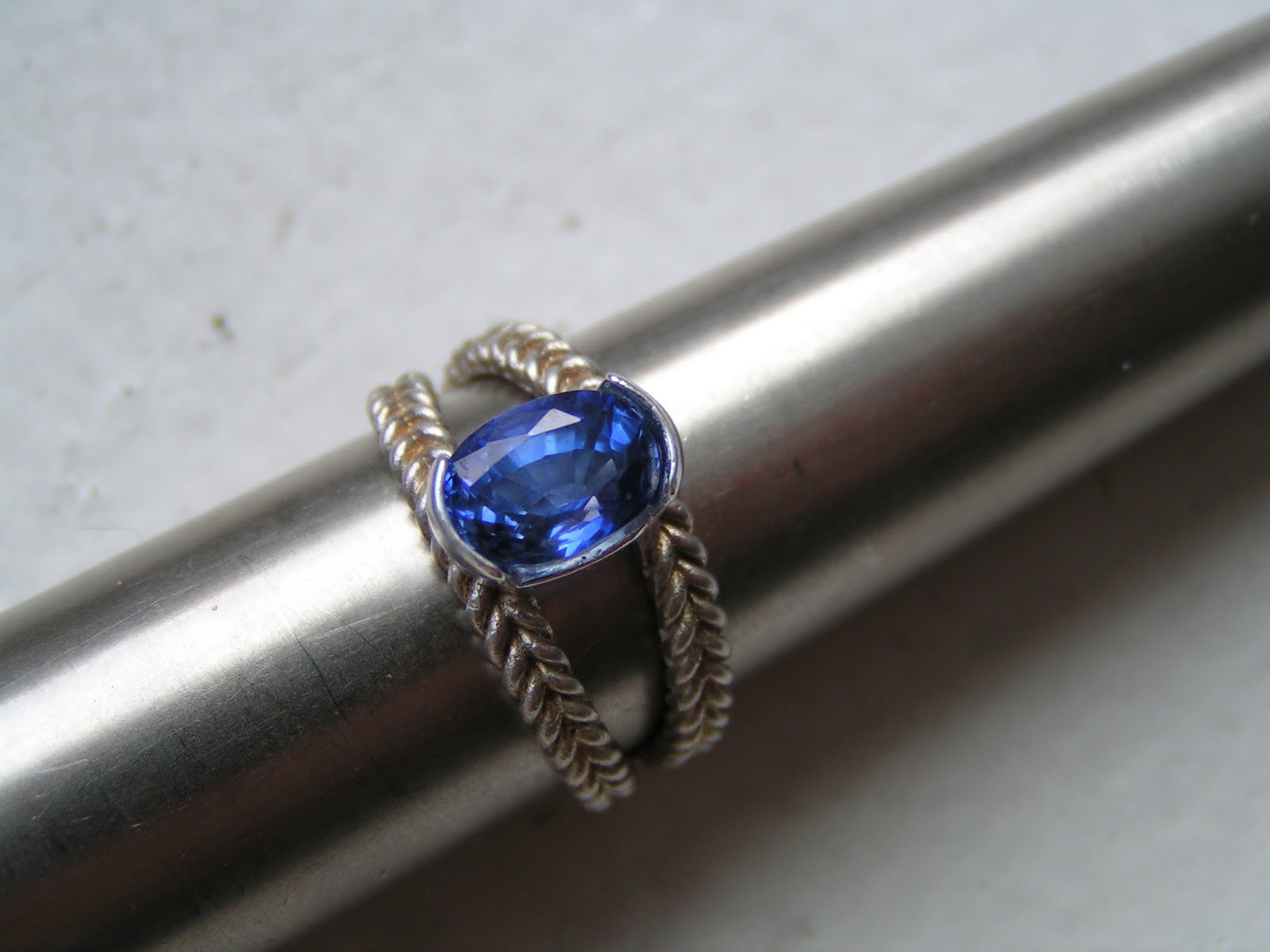
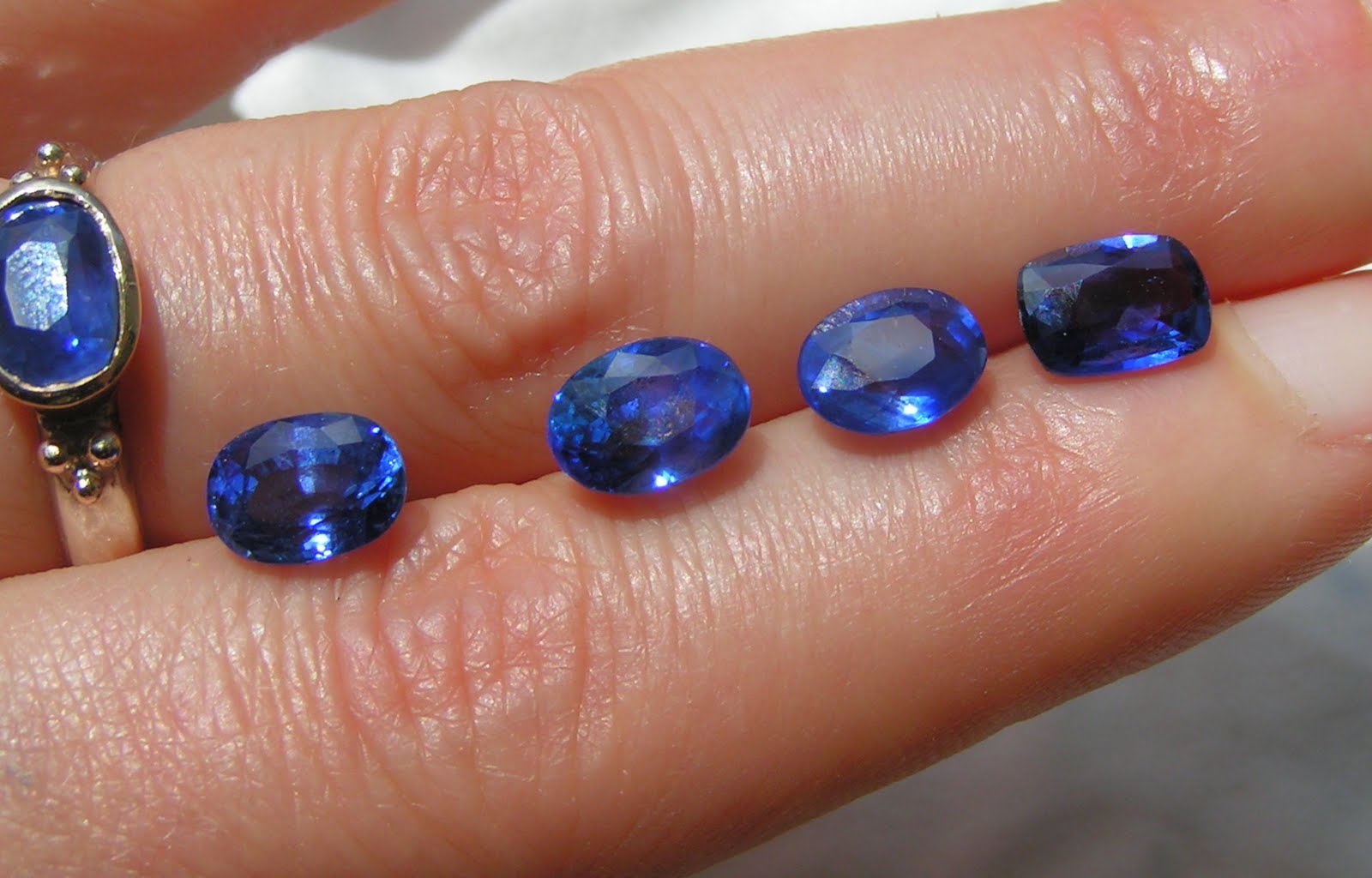
In June, the guy from Sri Lanka finally showed up on the street, and I lined up to be the first buyer. The unheated parcel was small, with perhaps 20 gems, no more. I just go by sight at this point. It’s hard to explain. I pick what I like best, then I loupe it to make sure I didn’t miss anything (scratches, inclusions, uneven color). I rest the gem between my index and middle finger to see if I can see through it (when you can, it’s called “window” and it’s not good). Then I tilt it in various ways to see if it still looks nice. I put it against silver to see if that brightens it up or darkens it. I pop it into a setting if I have one to see how it changes color. If it gets too dark I dismiss it. Here’s a picture of the gems I picked, and one that D. bought (but he got it elsewhere) - his is the one next to my ring.
One of my customers, Anya from Baltimore, wanted the first stone, and we spent almost an entire afternoon sending pix, questions and answers back and forth. In that process, we both learned a lot, and I thought it might be fun to share. So here, in no particular order, are our thoughts:
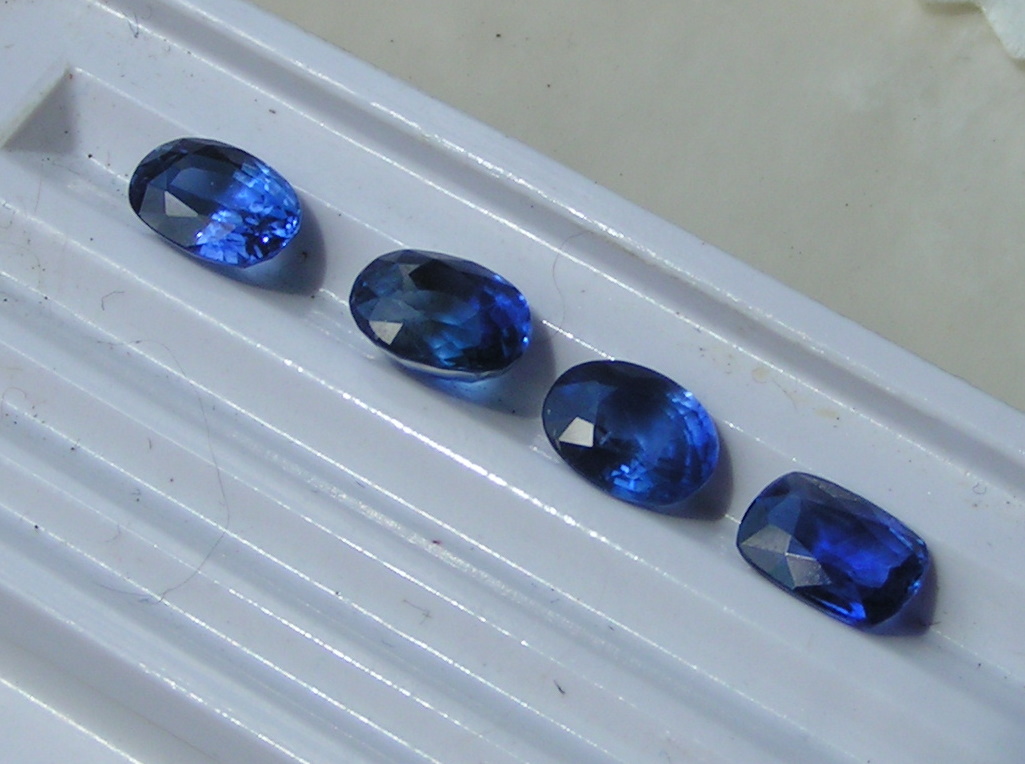
1. Color: the perfect Ceylon should be medium-dark blue. The color that marks a typical Ceylon is called “cornflower” but I’m still not sure what that actually is (neither are many people on 47th Street). So instead, I’m going to describe it as a medium to darker royal blue. If it is too light, the value decreases, if it is too dark it won’t look good. Ceylons are often too light, whereas Thai material is often too dark. You want a color that totally pops out at you. Ceylons have less purple in it than Burmas (Burmas have about 15-20%), sometimes they have no purple at all. In the picture below, two of the gems have a little more purple in them than the other two. Can you see which?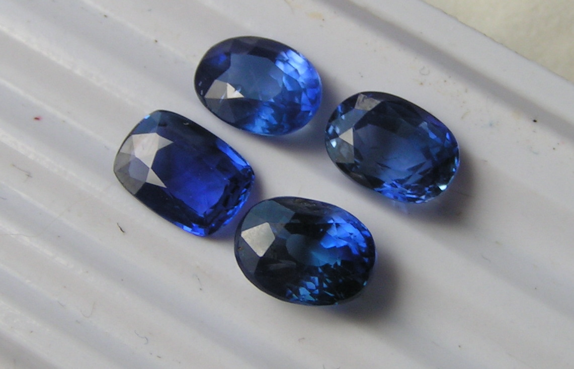
2. Brilliance: Burmas have more of a sleepy quality to them, and they are darker in color. A good Ceylon should be crisp. It should sparkle. Now the darker the gem, the less brilliance it has. That’s just the effect of the color and that’s ok. But it should still sparkle. In our parcel, the one with the most brilliance is D.s gem. High brilliance is often the mark of good cutting and many facets, but it also means that the gem material itself has few to no inclusions.
3. Inclusions: In the high end gems, there should be few to none visible to the naked eye. There will be some “silk” when you loupe it, though. Those are fine white lines. They’re ok, but nothing should be distracting when you just look at the gem. That makes it look ugly and devalues it. But I have seen a few very large (over 10 carat) Ceylons that did have a visible inclusion. In that size, however, this is not such a big deal. The size will outweigh it. But the smaller the gem, the more squaky clean you want it to be.
4. Zoning: this is the mark of a Ceylon and clearly distinguishes it from other sapphires. Zoning refers to uneven color distribution in the gem. If you turn any Ceylon upside down you will see the zoning. Sometimes, when you look at it from the side, you see that the most color is in the tip, the culet. The gem is cut in such a way as to make that color look even from the front. If you re-cut the gem so that it is flatter, you will lose all the color. That’s why Ceylons are often heavy and bulky in the cut. On rare occasion you see a flat gem with very even color distribution. That’s ideal, because it also lowers the weight and hence the price. In my array, the most even color distribution is in the cushion cut near the fingertip (from the front, they’re pretty much the same). Any Ceylon will have some zoning, and in a way that is good because you will be able to tell that it is genuine. A fake won’t have zoning (or inclusions, for that matter). The key is to minimize it, and to make sure it isn’t visible from the front. From the back it won’t really matter, unless you plan to set the gem upside down for some reason (and I have no idea why you would).
What’s the upshot when it comes to our four gems? To some degree, this is simply a matter of taste. The one on the left is judged to have twice the value of the others (and it cost twice as much). This is because it has the most even color distribution, the most brilliance, and the fewest inclusions. But if I were to pick one, I’d go for the cushion. It has a little more purple in it, a little more color. And it is nice and flat (so it costs less). But I already have mine.
Anya picked the larger oval (the second from the left in the first picture – can you see where it is in the other pics? Look at the overall shape of all gems, and look at each table to tell them apart). Anya’s gem also has more purple in it, it is inclusion free and has a lot of sparkle. The color really pops out at you, and I would have favored that one as well, depending on what design I liked for it. Ovals are easier to work with than cushions. Both Anya and I thought that the most expensive gem was stunningly beautiful but it just costs a lot of money. It’s a great buy, but you need to have more disposable income for it – but if you have that, I highly recommend it.